Right Panel: Difference between revisions
Jump to navigation
Jump to search
No edit summary |
|||
| (21 intermediate revisions by 3 users not shown) | |||
| Line 1: | Line 1: | ||
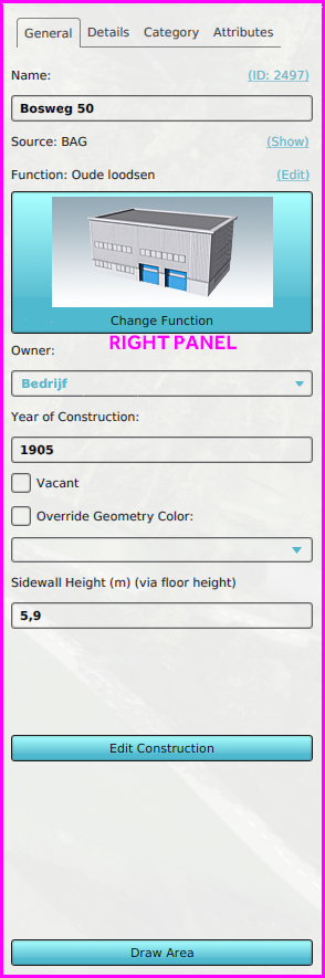
[[File:Editor_right_panel.png|frame|right|The Right Panel allows you to change properties of selected items in the left panel.]] | |||
The Right Panel allows you to change properties of selected items in the left panel. When no item is selected, or the selected item is removed, this panel is black or is not shown at all. | |||
The | |||
[[File:Q1-2016-EditorPanel.jpg|thumb|400px|left|The Tygron Editor. The Ribbon at the top of the screen, the Left Panel on the left side of the screen, the User Main Interface in the center of the screen, the Right Panel on the right side of the screen, and the Bottom Panel at the bottom of the screen.]] | [[File:Q1-2016-EditorPanel.jpg|thumb|400px|left|The Tygron Editor. The Ribbon at the top of the screen, the Left Panel on the left side of the screen, the User Main Interface in the center of the screen, the Right Panel on the right side of the screen, and the Bottom Panel at the bottom of the screen.]] | ||
<br clear=left> | <br clear=left> | ||
==Right panel layout== | |||
This example shows the right panel when a buildings button is selected in the [[ribbon]], and a [[Building]] is selected in the left panel. | |||
The general layout of these panel is as followed: | |||
[[ | * The first tab always contains important and general information, such as | ||
** Labels indicating the type of data | |||
** Text fields and areas to adjust the name and other text properties of the selected [[Item]] | |||
** ID hyperlink, opens the item in the [[API]] by opening the browser | |||
** [[Source]] link, which opens the [[Project Source table]] | |||
** Attribute text fields, sometimes with additional hyperlinks. | |||
** Color boxes, which can automatically convert selected colors to [[Color attribute]]s. | |||
** Check boxes for simple options | |||
** Buttons and hyperlinks that open additional panels | |||
** Draw Area button: Starts the process to spatially adjust the item manually. Always located at the bottom of this panel. | |||
* Extra information is shown in or more tabs, such as: | |||
** Attributes | |||
** Legends | |||
** Calculation configuration | |||
** Related other items | |||
{{Template:Editor_ui_nav}} | |||
[[Category:Interface]] | |||
[[ | |||
Latest revision as of 12:45, 30 January 2023

The Right Panel allows you to change properties of selected items in the left panel.
The Right Panel allows you to change properties of selected items in the left panel. When no item is selected, or the selected item is removed, this panel is black or is not shown at all.

Right panel layout
This example shows the right panel when a buildings button is selected in the ribbon, and a Building is selected in the left panel.
The general layout of these panel is as followed:
- The first tab always contains important and general information, such as
- Labels indicating the type of data
- Text fields and areas to adjust the name and other text properties of the selected Item
- ID hyperlink, opens the item in the API by opening the browser
- Source link, which opens the Project Source table
- Attribute text fields, sometimes with additional hyperlinks.
- Color boxes, which can automatically convert selected colors to Color attributes.
- Check boxes for simple options
- Buttons and hyperlinks that open additional panels
- Draw Area button: Starts the process to spatially adjust the item manually. Always located at the bottom of this panel.
- Extra information is shown in or more tabs, such as:
- Attributes
- Legends
- Calculation configuration
- Related other items