Viewer
The main user interface allows end users to interact with the 3D Visualization, from the perspective of a stakeholder. It is rendered on top of the 3D Visualization and displays panels to inspect the Current and Planned situation of a project. It also contains panels that allow stakeholders to plan actions that will change the Planned situation.
To change the current situation of a project, users will have to user the Editor. The editor panels are added around the main interface, as shown in the image below.
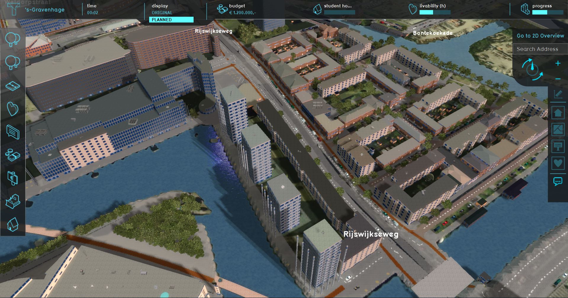
User Interface
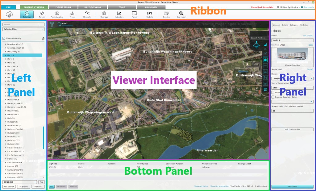
Editor Interface

Main interface elements
The Main Interface consists of the following main elements:
- Top bar: Top part of the screen; Displays Indicators and buttons to switch between the Current and Planned situation.
- Actions panel: Left part of the screen; Displays the Action Menus containing the Actions available to the selected Stakeholder.
- Navigation panel: Right part of the screen; Displays multiple things:
- a search bar for addresses and buildings
- the selected Camera and it's controls;
- a transparency view option,
- the Measuring tool button;
- the available overlays (sometimes grouped together);
- the Action Log;
- Legend panel: Bottom part of the screen; Displays a legend of the selected Overlay or for Drawing.
These elements can in open and show other panels in the User Interface.

Legend
When drawing a selection of an action in the 3D Visualization, or when displaying an overlay, a legend will be displayed at the bottom of the screen. The legend serves as a reference for which colors correspond to what information. For example, when viewing the ownership overlay, the legend will display which stakeholder is displayed with which color. When viewing the livability overlay, it provides a reminder of which colors indicate the most and least desirable values.
Additional interface elements
Besides the main interface elements described above, there are also a number of additional elements in the interface. These will appear and disappear depending on your interaction with the project.
Popups
- Main article: popups.
Popups are an important part of the interface, which are not immediately visible to the user. Instead, they appear whenever an action is taken, and input is required from the user concerning that action. This includes actions which the user takes themselves, but popups more often appear when other stakeholders take actions which the user in question must respond to. They also appear in the minimap in the form of exclamation marks.
Indicator panel

When you click on an indicator in the top bar, the indicator panel is opened. This panel displays information about the indicator you have selected. On the left side, at the top of the panel, is the name of the indicator, followed by its importance. A description of the indicator follows, to provide the user with information on what the indicator means, why it is important to the stakeholder and how to increase its score.
Under the "Explanation" heading, an overview displays the current score of the indicator, the target of the indicator, and the amount of progress which still needs to be made to score 100% on the indicator. The exact layout of this information differs per indicator.
On the right side of the panel, two graphs are visible. The top graph displays the total score on the indicator over time. The bottom graph displays the sub scores for the indicator over time. For example, in the case of the parking indicator, the bottom graph shows the amount of parking spaces per zone.
Budget panel

The budget panel can be accessed in two ways. You can open the indicator panel for your budget, and then press the button "To budget". Alternatively, when a finances category is available in the category panel, one of the available actions may be "Finance view". By selecting "Finance view, the budget panel is opened.
The budget panel displays an overview of your expenses and incomes. The left side of the panel displays the list of expenses. The expenses are collected in categories, which can be expanded by clicking the arrow next to a category. This displays all expenses within that category. At the bottom, in red, the total expenses are displayed. The right side of the panel displays the incomes in a similar fashion. Sources of income are categorized together, and can be expanded where desired to see what sources of income exist in a particular category. At the bottom, in green, the total amount of income is displayed.
At the bottom of the panel, the net balance is displayed. This is the amount of money the stakeholder has at that moment. The net balance is calculated by taking the total income and subtracting the total expenses from this value.
Hover panel

When you click the cursor still over any part of the project area, the hover panel will appear. The hover panel will display information about the area your cursor is pointing at, based on which overlay is currently active. By default, it display information about the:
- type of terrain;
- buildings
- address;
- owner;
- and data source.
Cinematic panel

Whenever text is displayed during a cinematic, it appears in the cinematic panel. While the cinematic panel is visible, the cinematic camera is paused. When you have read the text in the cinematic panel, you can click "continue" to close the cinematic panel and continue the cinematic.
The escape menu is opened by pressing the "Esc" key on your keyboard. The escape menu allows you to access the settings screen by pressing "Settings", and to display the credits by pressing "Credits". In single user and multi user sessions, you are also able to exit the session from this menu, by pressing "Exit". In single user sessions, you are also able to save the session state by pressing "Save".
Settings screen

The settings screen allows you to adjust the graphical settings of the Tygron Platform. By raising the values, you increase the graphical quality of the virtual environment. By lowering the values, you lower the stress on your hardware and thus increase performance. The settings panel offers four default settings: "Low", "Medium", "High" and "Full". Each of these options set the graphics to predefined values. By selecting "Advanced", you are also able to finely adjust which graphical settings to increase and decrease.
You can also adjust the volume by using the "Volume" slider.