Indicator panel: Difference between revisions
No edit summary |
No edit summary |
||
| Line 8: | Line 8: | ||
{{article end | {{article end | ||
|notes= | |notes= | ||
* To get started with html, you can visit [https://www.w3schools.com/html/] | * To get started with html, you can visit [https://www.w3schools.com/html/ w3schools] | ||
}} | }} | ||
{{viewer nav}} | {{viewer nav}} | ||
Revision as of 16:56, 9 January 2024
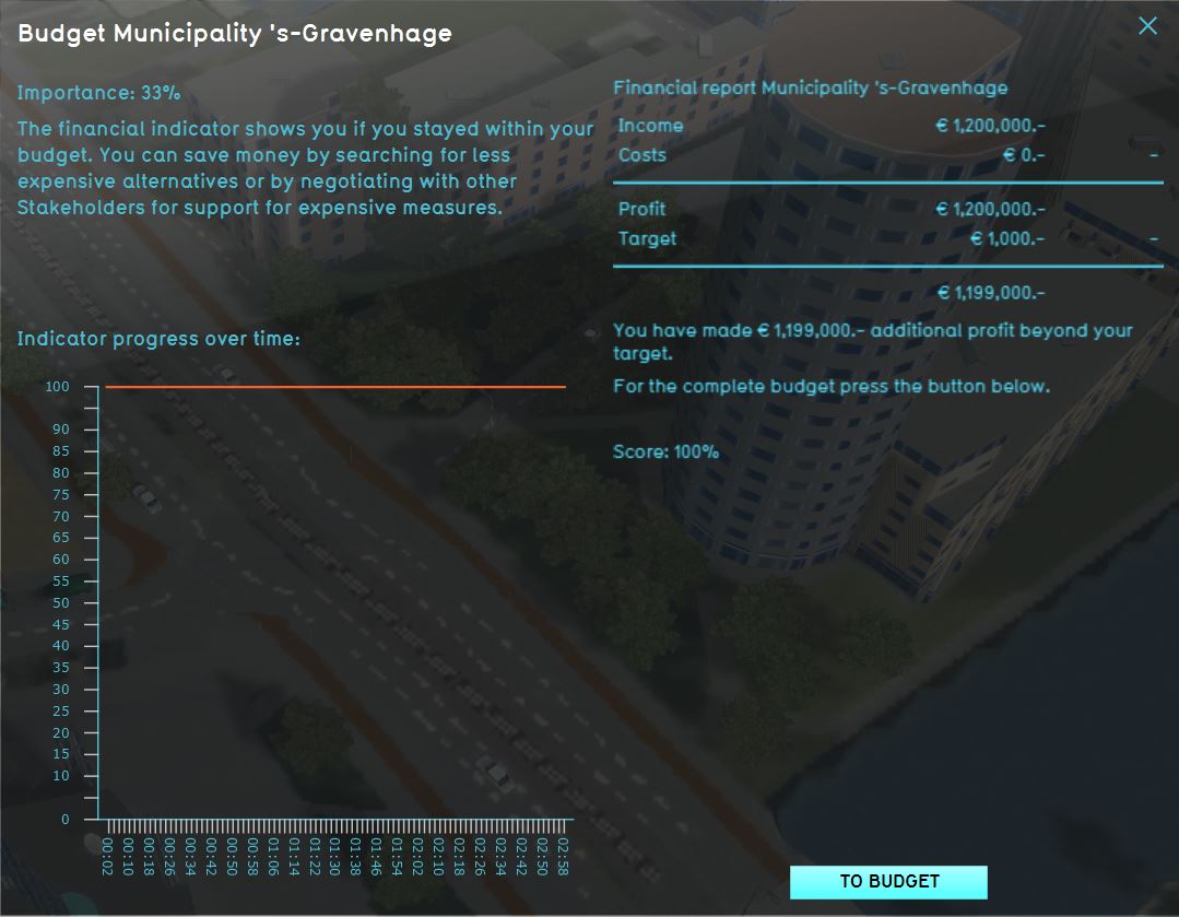
When you click on an indicator in the top bar, the indicator panel is opened, displaying the information of that indicator. On the left side, at the top of the panel, is the name of the indicator. A description of the indicator follows, providing contextual information to the user on what the indicator represents, why it is important to the stakeholder and how to improve its score.
Under the "Explanation" heading, an overview displays the current score of the indicator, the target of the indicator, and the amount of progress which still needs to be made to score 100% on the indicator. Since both the description and the explanation can be provided as html, you are free to define your own layout of this information.
Below the description on the left side of the panel, a graph is visualized. This graph displays the total score on the indicator over time.
Notes
- To get started with html, you can visit w3schools
