How to access your project data in Power BI: Difference between revisions
Jump to navigation
Jump to search
No edit summary |
No edit summary |
||
| Line 14: | Line 14: | ||
| A new panel opens, and by default, a table is created of all the properties. | | A new panel opens, and by default, a table is created of all the properties. | ||
| Click on the Close and Apply button. | | Click on the Close and Apply button. | ||
| In the | | In the ''Visualization'' panel, select the second option named ''Stacked column chart''. | ||
| A preview should be added to your page section, indicating you need to drag or select a field. | | A preview should be added to your page section, indicating you need to drag or select a field. | ||
| In the | | In the ''Visualization'' panel, identify the '''X-Axis''' data field. | ||
| In the | | In the ''Data'' panel, unfold the connection and drag the name field from the list of properties to the '''X-Axis''' data field. | ||
| Next, select a value property | | Next, select a value property, such as ''AANTAL_INWONERS'' and drag this property to the '''Y-Axis''' data field. | ||
| The bar chart should now be created. | | The bar chart should now be created. | ||
}} | }} | ||
| Line 28: | Line 28: | ||
File:PowerBI_Close_And_Apply.png|Close and apply. | File:PowerBI_Close_And_Apply.png|Close and apply. | ||
File:PowerBI_Empty_Bar_Chart.png|Vertical bar chart selected from the Visuals. | File:PowerBI_Empty_Bar_Chart.png|Vertical bar chart selected from the Visuals. | ||
File:PowerBI_Bar_Chart.png| | File:PowerBI_Bar_Chart.png|Stacked column chart with neighborhood name and number of inhabitants. | ||
</gallery> | </gallery> | ||
{{article end | {{article end | ||
Revision as of 14:48, 15 November 2023
Data from projects can be accessed by Power BI using a web connection for the GeoJSON endpoint.
How to access your project data in Power BI.:
- Open any project, and preferable put it on Keep alive.
- Choose an item that you want connect to, such as Neighborhoods
- Hover over Neighborhoods, and in the popup select Export Geo data
- As the format, select GeoJSON (Convert collections to MultiPolygons)
- Click on the second Copy URL button, next to Online GeoJSON Endpoint.
- Open the Power BI Desktop application
- Create a new project or open an existing one.
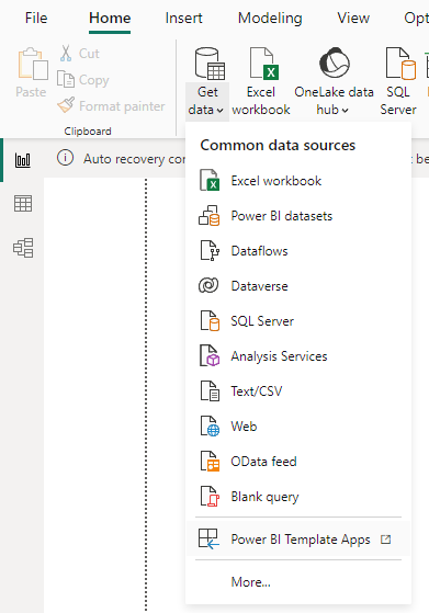
- Under add Get Data, select Web
- Paste the link in the url field and select ok.
- A new panel opens, and by default, a table is created of all the properties.
- Click on the Close and Apply button.
- In the Visualization panel, select the second option named Stacked column chart.
- A preview should be added to your page section, indicating you need to drag or select a field.
- In the Visualization panel, identify the X-Axis data field.
- In the Data panel, unfold the connection and drag the name field from the list of properties to the X-Axis data field.
- Next, select a value property, such as AANTAL_INWONERS and drag this property to the Y-Axis data field.
- The bar chart should now be created.
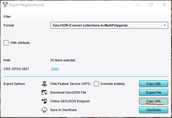
Copy URL for "Neighborhoods as GeoJSON"-endpoint.
Paste the URL and create a web connection.
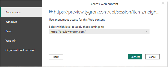
Choose anonymous connection.
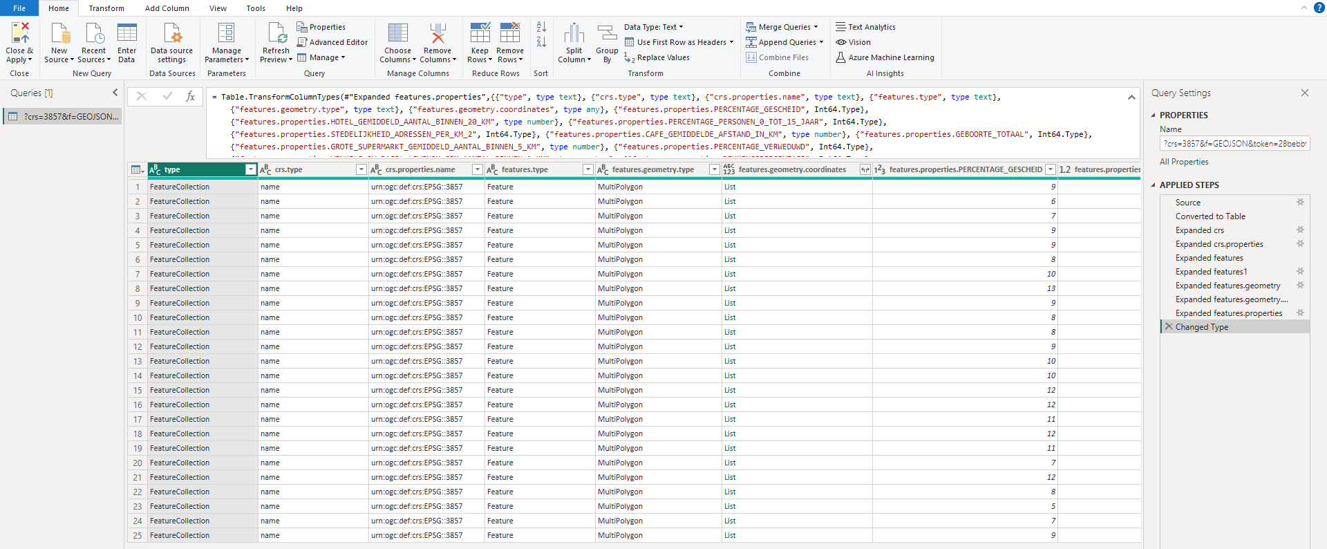
Created table for the GeoJSON web connection.
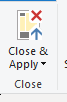
Close and apply.
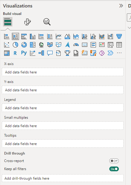
Vertical bar chart selected from the Visuals.
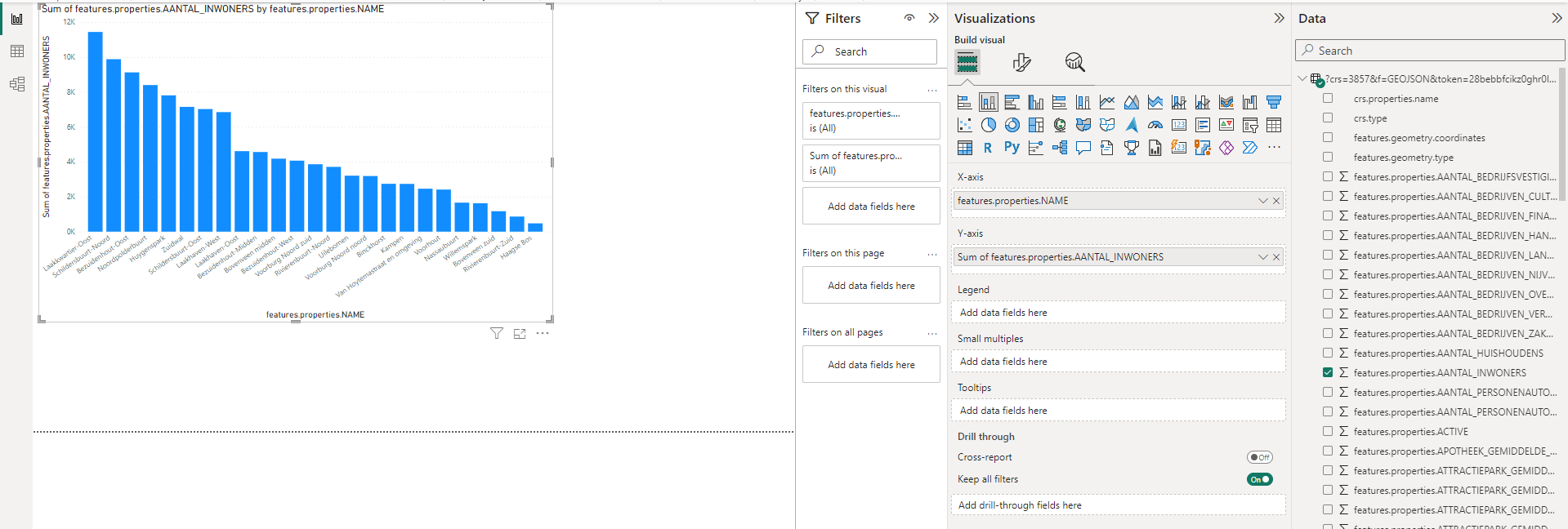
Stacked column chart with neighborhood name and number of inhabitants.


