Heat Stress Overlay: Difference between revisions
| Line 2: | Line 2: | ||
==What the heat overlay is== | ==What the heat overlay is== | ||
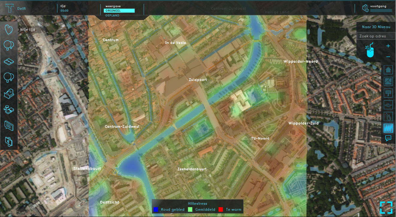
[[File: | [[File:Heatstress_overlay.PNG|thumb|420px|left|Example of the heat stress overlay]] | ||
The heat stress overlay is an [[Overlay]] which displays the average temperature deviation (positive or negative) in different colors for the project area, indicating transitions in temperatures, resulting in heat stress. | The heat stress overlay is an [[Overlay]] which displays the average temperature deviation (positive or negative) in different colors for the project area, indicating transitions in temperatures, resulting in heat stress. | ||
The default colors of the overlay generally mean the following: | The default colors of the overlay generally mean the following: | ||
* Red: Red indicates the hottest area's, compared to the surroundings. | |||
* Green: Green indicates not much deviation from the average temperature deviation. | |||
* Blue: Blue indicates the coolest area's, compared to the surroundings. | |||
It is possible to change the colors of the overlay by editing the [[Legend]] in the Legend tab of the overlay. | |||
It is possible to change the colors of the overlay by editing the [[Legend]]. | |||
==Additional information displayed in hover panel== | ==Additional information displayed in hover panel== | ||
Revision as of 11:08, 7 August 2018
What the heat overlay is
The heat stress overlay is an Overlay which displays the average temperature deviation (positive or negative) in different colors for the project area, indicating transitions in temperatures, resulting in heat stress. The default colors of the overlay generally mean the following:
- Red: Red indicates the hottest area's, compared to the surroundings.
- Green: Green indicates not much deviation from the average temperature deviation.
- Blue: Blue indicates the coolest area's, compared to the surroundings.
It is possible to change the colors of the overlay by editing the Legend in the Legend tab of the overlay.
Additional information displayed in hover panel
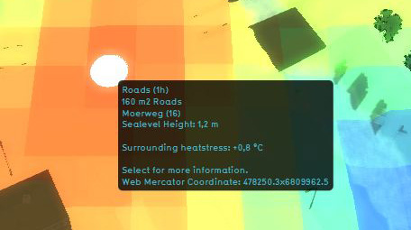
The hover panel gives additional information when the overlay is active.
Surrounding Heatstress
The amount of heat stress from the surroundings in °C.
Calculation Model
Because the Heat Overlay is directly linked to the Heat Stress indicator, it is currently not possible to load this Heat overlay separately. To activate the Heat overlay in you project, please see the documentation about Adding/removing indicators.
Adding and removing
- Select in the editor 'Geo Data' from the ribbon
- Select 'Overlays' from the ribbon bar
- Select the Heat stress overlay from the drop down menu
- Select in the editor 'Geo Data' from the ribbon
- Select 'Overlays' from the ribbon bar
- Select the desired overlay from the list of active overlays on the left panel
- Select 'remove' from the bottom of the left panel
- Confirm the removal in the pop up confirmation message

