Livability Overlay: Difference between revisions
Jump to navigation
Jump to search
No edit summary |
|||
| Line 1: | Line 1: | ||
{{learned|what the | {{learned|what the quality of life overlay is.|which information is displayed on the quality of life overlay.|which additional information is displayed in the hover panel.|}} | ||
==What the heat overlay is== | ==What the heat overlay is== | ||
Revision as of 08:25, 27 August 2015
What the heat overlay is
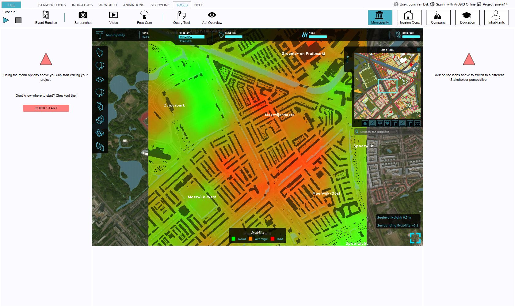
The quality of life overlay is an Overlay which displays the average quality of life in different colors for the project area, indicating good, average and bad quality of life.
Color: Green (Good)
Indicates a good quality of life, compared to the surroundings.
Color: Orange (Average)
Indicates an average quality of life, compared to the surroundings.
Color: Red (Bad)
Indicates a bad quality of life, compared to the surroundings.
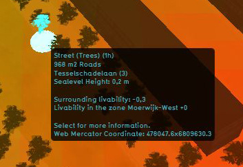
Additional information displayed in hover panel
The hover panel gives additional information when the overlay is active.
Surrounding Livability
The value of livability in the surroundings.
Livability in the Zone
The average value of the livability in the entire zone
For information on adding and removing Overlays see...

